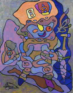
① 色彩論~明るさの対比が極小の場合に極大となる
Maximum when the contrast between color theory and brightness is minimal
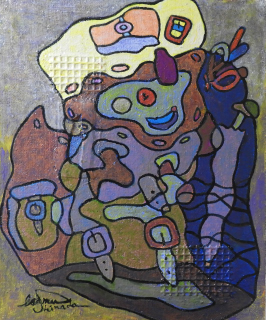
①色彩論 *明るさの対比は 極小に
日本語 English
①
色彩論~明るさの対比が極小の場合に極大となる
Maximum when the contrast between color theory and brightness is minimal
①色彩論 *明るさの対比は 極小に
色彩が言語と同様、コミュニケーションの有力な手段となる。 普遍性を持つ、部分を色彩設計に活用。
将来は 色の好みの違いが薄れ、世界一色に成る事も予想される。(現色)
色彩のもつ韻律的な構成、
その変化、変種(ヴァリエーション)への注意、全体を見透しての盛り上げに用いられるところの色彩の用意、
全色彩トーンを 向に置くべきか、さらに、いかに配置すべきか、色彩のリズムで「ダレル」ところを救う」(中241)、
暖色系で明度、彩度の高いトーンの色彩は 興奮性、膨張性が有り、手前に前進して来る傾向がある。
これに対して寒色系で中~低の明度、彩度の色彩では 鎮静性、収縮性があり、 後方に後退する傾向がある。(形)
視覚物質は長波長の光(黄)に反応するものと、短波長の光(青)に反応するものとの2種に分化し
、第3の発達段階においては 長波長の光に反応する物質が更に分化して、
更に長い波長の光(赤)に反応するものと中波長の光(緑)に反応するものとに分化する。
黄 青 赤 緑 (心)
色彩映画の技術陣の人々は 日本民族の豊富な色彩感と
、そして絵巻の伝統で鍛えられる色彩構成の伝統を世界にデビューする機会を今、眼前にした事を強く意識すべきである。
色彩への日常の敏感な観察と訓練が必要である。(中)
色彩だけの領域は その効果を解像されない。
又、絵画の色彩又は質感の勾配をやたらに増やすと視覚的インパクトが消えてしまう。(形モ)
色の対比に関しては キルシュマンの法則が名高い。
1、 同時対比の強さは 誘導刺激領の面積の平方根にほぼ比例する。
2、 色調の同時対比は 明るさの対比が極小の場合に極大となる。
3、 明るさが 均しい場合には 色対比の効果は 最大として、飽和度は 満たされた状態となる。
色調の対比は 誘導刺激の飽和度に依存し、対比色の飽和度は 誘導刺激の飽和度の対数に ほぼ比例する。(心)
1、 材料に対応して、構成されたもの、材料の特性と対応したもの。
2、 一目でわかる視覚的なもの、読み取り易く、識別し易く、思い浮かべ易い、幾何学的構造を備えているべきである。
3、 基本色の位置とその配列が明確でなければならない。
基本色の位置、混色によって生じる色、特に、補色の位置関係が一目で見渡せるように表示すべきである。
配列図の作成にあっては 色相間の距離を正確に取ることも重要であるが、
それよりも、視覚的に明快であると言う事の教育的価値を優先すべきである。(色実)
ゲーテの色彩論は 色彩の心理的影響を含めて、自然の直観的把握の態度として これを解釈しなおすと、
人間が自然に対してとる根本的態度の一つとして重要な意味をこれに認めることができる。(美)
「ゲーテの色彩論がシュタイナーによって拡大され、色彩がもたらす魂的、霊的活動が意識的に把握されるようになったのです」(オ)、
*「シュタイナーの色彩理論、黄、青、赤」(か)、
*「ヤングヘルムホルツの3原色説-網膜には、赤、緑、青(又は )の色の刺激に対してよく働くところの3種の錐体がある」(心59)、
*「ヘリングの反対色説-白黒物質、黄青物質、赤緑物質の3種の視覚物質が存在することを仮定し、
それらが光の波長に応じて、異化作用、あるいは、同化作用をいとなむ」(心59)、
* 「プールキンエの法則、赤-緑」(中51)、
* 「本川弘一の説、本川は、網膜の感電性を測定し、それに基づいて網膜の中央部では、赤、緑、青の光に対し、
周辺部では 赤、緑、黄の光に対しそれぞれの独立に働く機能があることを仮定している」(心60)、
* 「ウィットゲンシュタイン」白、茶色、灰色、赤と緑、物理学的色彩論や、生理学的色彩論を退け、
かなりはっきりと<現象学的>な色彩の立場に立つ」(か)、
* 「弦端対比(ルゲン説)赤の中心、青の中心、黄」(色実)「擬似3原色、
黄(レモンイエロー)、赤(カーマインレッド)、
青(ウルトラマリンブルー)」色実)
へルッエルの不動基本十字形~深紅色と緑、ウルトラマリンと橙(色実)
ルンゲの調和のとれているのは 青:橙、黄:紫、赤:緑 (最も生気に満ちた対比) この対比はとても 快適な印象を与える。(色実)
刺激頂は、老齢に近付くにつれて、低下する傾向がある。音刺激の強さは 領域を超えると 痛みの感覚に変り、
さらに進めば、聴覚器官の損傷を生ずるようになる。(心)
黄 緑 青
不変色赤と緑の境界線に 糸などを置いて 円環に それぞれの背景の色による対比効果が表れる。
このような対比の現象は 絵画などにも 良く使われている.
赤や黄は 硬い感じが有り、青や緑は 柔らかい感じである。また、赤には迫力があり、白も、近くにある場合は 生き生きとして迫力が有る。(心)
平面色~青空のような色
固い感じを与えず、また その色のある場所までの距離が はっきりせず、漠然として、特定の物体に属していると 言うような感じを与えない色である。
それは2次元的、平面的に拡がった感じを与えるが その面は 堅い組織をもたず、非実在的で 柔らかく厚みが有り、
その中に入り込んで行く事が出きる様に感じられしかも、ほとんど、常に視方向に対して、直角あるいは、多少湾曲して見られる色
表面色~物の表面についている色
その面は 堅く、何処に有るか、どんな方向に有るか等をすぐ指摘する事ができ 物体の表面の性質に応じて ザラザラした感じや滑らかな感じを与える。
着色液や寒天のように 一定空間を3次元的に満たしている。霧の色は それを通して、背後の対象が見える限り空間色であるが、
霧が濃くなって、背後に対象が見えなくなったときには、平面色の性質に近付いて行く。人の心に 審美的な反応を生むことができる」(形38)
「原色好きは 万国共通「赤は王者の緋色、青は荘厳なウルトラマリンである」(芸空110)、
「赤は 平面に付いて離れぬ性質をもつ激しい内面の沸騰、内面的緊張により、黒及び白から区別される」(カ68)、
「青は 人を無限の世界へと誘う、かれのうちに純粋なものへのあこがれをよび醒ます」(カ247)、
「色彩の高揚と絶頂は 深紅色にありとする<ゲーテ>」(色実49)
「マゼンダ色を朱色よりも、好ましいと思うのは透明感が感じられるからであろう。舶来的ハイカラな感じを与える色」(色感)、
「絵画は 命題以上のものが赤であり、緑でありうる。
赤は 理論を基盤とし、生命の輝きである。R,シュタイナー(か)
緑は 感覚的イメージを想像力によって喚起する」(視69)
黄は 霊の輝きである。青は魂の輝きである。
ゲーテは<眼は形態を見ているのではない、もっぱら、明暗或いは色彩が浮かび上がらせるものを見るのである。
まさしく、ここに、色彩とモルフアー(動的形態)の接点がうかがわれる。(か)
私は ゲーテの推薦色やルンゲの調和色を参考に、下記の色彩を主に、使用しております。
カドミユムエロ― ~不変色、ホワイト三色を使用、
カドミュームレッド~常にバーミリオンに優る。
マゼンダ~ピンクは 魂の生きた像を表す。
青~ セルリアンブル―~いくぶん緑を帯びた鮮かな色相、堅牢、
緑~生命の死せる像をあらわす。
ブラック~白、又、光は魂の霊的な像を表す。
紫~不安定な色で、高貴な色
美は 激しい意志では とらえられない。ほんのわずかな過不足、それが 美に於いては 大問題となるのである。
最大の問題となるのである。(ニーチェ)
English
① Color theory
* The contrast of brightness is extremely small.
Color is a powerful means of communication, just like language. T
he part with universality is used for color design. In the future,
it is expected that the difference in color preferences will diminish and it will become the best color in the world. (Current color)
The prosodic composition of colors, their changes, attention to variant
variations,
the preparation of colors to be used for the excitement of the whole.
Whether all color tones should be placed facing away, and how to arrange
them,
save the "Darrell" place with the rhythm of the colors. "
Tends to move forward.
On the other hand, cool colors with medium to low lightness and saturation
are sedative and contractile, and tend to recede backward.
It was Visual substances are divided into two types, those that respond to long-wavelength light yellow and those that respond to short-wavelength light (blue),
and in the third development stage, substances that respond to long-wavelength
light further.
It differentiates into those that respond to light of longer wavelengths
and those
that respond to light of medium wavelengths.
It was Yellow, blue, red, and green color movie engineers should be strongly
aware that they now have the opportunity to debut in the world the rich
color sense of the Japanese people and the tradition of color composition
trained by the tradition of picture scrolls.
Is. Daily sensitive observation and training of color is required. In the area of color only,
he cannot resolve the effect.
Also, if the gradient of the color or texture of the painting is increased
too much, the
visual impact disappears. His Kirschmanian law is renowned for the contrast of colors.
The strength of the simultaneous contrast is almost proportional to the
square root of the area of the induced stimulus area.
The simultaneous contrast of color tones is maximized when the contrast of brightness is extremely small. When the brightness is uniform, the effect of color contrast is maximized,
and the saturation is satisfied.
The contrast of color tone depends on the saturation of the induced stimulus,
and the saturation of the contrasting color is almost proportional to the logarithm of the saturation of the induced stimulus. Let's limit ourselves to the requirements required for color arrays.
Those that correspond to the material, those that correspond to the characteristics
of the material. It should have a visual, easy-to-read, easy-to-identify,
easy-to-remember, geometric structure that is easy to see at a glance.
The position of the basic colors and their arrangement must be clear.
The positions of the basic colors and the colors produced by the mixing,
especially the positional relationships of the complementary colors,
should be displayed so that they can be seen at a glance. It is important
to keep the distance between hues accurate, but the educational value of
being visually clear should be prioritized.
Goethe's theory of color, including the psychological effects of color,
has an important meaning as one of the fundamental attitudes that human
beings take toward nature when he reinterprets it as an attitude of intuitive
grasp of nature.
I can admit it. "Goethe's theory of color was expanded by Steiner,
and the spiritual and spiritual activities brought about by color became consciously grasped." (E)
* "Steiner's Color Theory, Yellow, Blue, Red" (or),
* "Young-Helmholtz's three primary color theory-the retina has three cones that work well against red, green, blue, or color stimuli."
* "The opposite color theory of Herring-Assuming that there are three
kinds of visual substances, black-and-white matter, yellow-blue matter,
and red-green matter,
they have catabolism or anabolic action depending on the wavelength of
light.
"Nam" "Poolkinje's Law, Red-Green"
Link
8.Couleur et matiere
Top page
index.html