Color technology
色彩技術
色が等しく見える様にするとか、色違いであることがわかるのに必要な色刺激の特性を調べて、
刺激と反応の函数関係を明らかにする事を 表色と呼んでいる
。
黒は 有彩色を輝かせる。白を用いて白く曇らせる方法、不透明絵の具の絵画技法において、
非常に重要な役割を果たす。
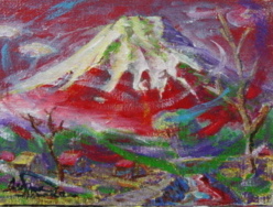
ウルトラマリンの地の上に緑を置くとオレンジ黄の色味を帯びて見え、
オレンジ黄の地の上に緑を置くと、青みを帯びて見える
コバルトブルーは 緑青の地色の上では 紫味を帯び、紫の地色の上では 緑がかった色味を生じる。
全て有彩色は 黒より 明度が高いのであるから、黒は 有彩色を輝かせる。
ウルトラマリンは 銅を含んだブルーの上に置く
アイボリーブラックは マースブラックの上に置く
白を多量に必要とするのは キャンバスの下地を作る場合であろう
色彩使用の最終目標は 美的で快適であるばかりでなく緊張があること、
興奮させる事操作しやすいこと 自由である事 広がりのあること、
同じ色が何度も繰り返して使われることとか 色が僅かずつ移行している事、
(色のグラデーション)あるいは 明度の釣り合いが取れていることなどに
興味の中心を向ける様である。
色を使った広告は 白黒だけの広告の倍
Color technology
To make the colors look the same,
or to investigate the characteristics of the color stimulus necessary to know that
the colors are different,
Clarifying the function relationship between stimulus and response is called color.
Black makes the chromatic color shine.
It plays a very important role in the method of clouding white with white and
the painting technique of opaque paints.
Placing green on the ground of ultramarine makes it look orange-yellow,
and putting green on the ground of orange-yellow makes it look bluish.
Cobalt blue produces a purplish tint on a patina background and a greenish tint on a purple ground color. It was All chromatic colors are brighter than black,
so black makes chromatic colors shine.
Place ultramarine on a blue containing copper Ivory Black puts on top of his Mars Black He would need a lot of white if he made a canvas base The ultimate goal of using color is not only aesthetic and comfortable, but also tension. Exciting,
easy to operate, free, expansive, The same color is used over and over again,
and the colors are gradually shifting. It seems that the focus of interest is on (color gradation)
or the balance of brightness.
Advertising using color is twice as much as advertising using only black and white、